Choosing the right colors for your designs can be tricky, but it doesn't have to be. Understanding how colors work together can help you create beautiful and unique color palettes. This guide will walk you through the basics of color theory, how to create your own palettes, and how to apply them effectively in your designs. With a little practice, you'll be able to choose colors with confidence and style!
Key Takeaways
- Learn the basics of color theory to understand how colors interact.
- Finding inspiration from nature and art can lead to unique palettes.
- Testing your colors before finalizing can prevent mistakes.
- Using a mix of neutral colors can enhance your designs.
- Color choices can greatly affect how people feel about your work.
Understanding the Basics of Color Theory
The Color Wheel and Its Importance
The color wheel is a visual tool that helps us understand how colors relate to each other. It shows primary, secondary, and tertiary colors.
- Primary Colors: Red, Blue, Yellow
- Secondary Colors: Orange, Green, Purple
- Tertiary Colors: Colors made by mixing primary and secondary colors, like Teal and Amber.
Primary, Secondary, and Tertiary Colors
Understanding these categories is essential for creating appealing designs. Here’s a quick breakdown:
| Color Type | Examples |
|---|---|
| Primary Colors | Red, Blue, Yellow |
| Secondary Colors | Orange, Green, Purple |
| Tertiary Colors | Teal, Amber, Chartreuse |
Color Harmony and Contrast
Color harmony is about using colors that look good together. It can create a sense of balance in your designs. Here are some tips:
- Use complementary colors for contrast.
- Try analogous colors for a more subtle look.
- Consider the emotional impact of colors.
Color is not just about aesthetics; it can influence feelings and perceptions. Understanding color theory can help you make better design choices.
Creating Unique Color Palettes from Scratch

Creating your own color palette can be a fun and rewarding experience. Here are some steps to help you get started:
Finding Inspiration for Your Palette
- Look at Nature: Nature is full of beautiful color combinations. Take a walk and observe the colors around you.
- Art and Design: Browse through art galleries or online platforms like Pinterest for color inspiration.
- Fashion Trends: Check out current fashion trends, as they often showcase unique color pairings.
Using Color Palette Generators
Color palette generators can simplify the process of creating palettes. Here are a few popular options:
- Coolors: A fast and easy tool to generate color schemes.
- Adobe Color: Offers various color rules to help you create harmonious palettes.
- Color Hunt: A curated collection of beautiful color palettes.
Testing and Refining Your Palette
Once you have a palette, it’s important to test it:
- Mockups: Create mockups to see how your colors work together in real designs.
- Feedback: Share your palette with friends or online communities for feedback.
- Adjust: Don’t be afraid to tweak your colors until they feel just right.
Remember, the right colors can make your design stand out! Experimenting with different combinations will help you find what works best for your project.
By following these steps, you can build a unique color palette that reflects your personal style and enhances your creative projects. Happy designing!
Applying Color Palettes in Design

Color Palettes for Branding
When creating a brand, color plays a crucial role. The colors you choose can convey your brand's personality and values. Here are some key points to consider:
- Consistency: Use the same colors across all platforms.
- Recognition: Choose colors that make your brand easily identifiable.
- Emotion: Different colors evoke different feelings; select colors that resonate with your audience.
Using Color in Digital Interfaces
In digital design, color can enhance user experience. Here are some tips:
- Contrast: Ensure text is readable against the background.
- Hierarchy: Use color to guide users through the interface.
- Accessibility: Consider color blindness; use patterns or textures along with color.
| Color Type | Purpose | Example |
|---|---|---|
| Dominant Color | Main brand color | Blue for a tech brand |
| Accent Color | Highlights important elements | Red for buttons |
| Background Color | Sets the overall mood | Light gray for calmness |
Balancing Colors in Print Design
When designing for print, balance is key. Here are some strategies:
- 60-30-10 Rule: Use 60% dominant color, 30% secondary, and 10% accent.
- Test Prints: Always print samples to see how colors look on paper.
- Material Matters: Different materials can affect how colors appear.
Color is not just about aesthetics; it’s about creating a connection with your audience. Choose wisely to enhance your design!
Advanced Techniques for Color Selection

Understanding Color Psychology
Color psychology is the study of how colors affect our feelings and behaviors. Different colors can evoke different emotions, which is crucial when selecting a palette. Here are some common associations:
- Red: Excitement, passion
- Blue: Calm, trust
- Green: Growth, harmony
Using the 60-30-10 Rule
This rule helps in balancing colors in your design. It suggests:
- 60% of the dominant color
- 30% of a secondary color
- 10% of an accent color
This method ensures a pleasing visual balance.
Combining Different Color Schemes
Mixing color schemes can create unique palettes. Here are a few popular combinations:
- Complementary: Colors opposite each other on the wheel
- Split-complementary: A base color and the two adjacent to its opposite
- Triadic: Three colors evenly spaced on the wheel
Experimenting with various color schemes can lead to exciting and unexpected results.
Highlighting Unique Palettes
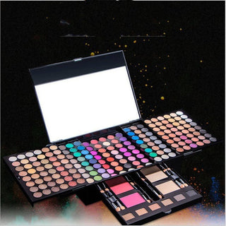
For instance, consider the eyeshadow palette shop cashymart's 18-color collection. It features vibrant, waterproof shades that can inspire your own creative designs. This palette offers a range of richly pigmented colors perfect for various projects.
By understanding these advanced techniques, you can elevate your color selection skills and create stunning designs that resonate with your audience.
Tools and Resources for Color Palettes

Top Online Color Palette Generators
When it comes to creating color palettes, there are several great tools available online. Here are some popular options:
- Adobe Color: This is a comprehensive tool that allows you to create and explore various color schemes. You can upload images to extract colors, making it a favorite among designers.
- Coolors: A user-friendly generator that helps you find and save your favorite colors. You can easily play around with different shades and hues.
- Canva Color Palette Generator: This tool is perfect for beginners. You can upload an image, and it will generate a color palette based on the colors in that image.
Books and Courses on Color Theory
Understanding color theory is essential for creating effective palettes. Here are some recommended resources:
- "Color Theory for Designers": A book that covers the basics of color theory and its application in design.
- Online Courses: Websites like Coursera and Udemy offer courses on color theory that can help you grasp the concepts better.
- Workshops: Look for local workshops that focus on color in design. Hands-on experience can be very beneficial.
Community and Feedback for Color Choices
Getting feedback on your color choices is crucial. Here are some ways to do it:
- Design Forums: Join online communities where you can share your palettes and get constructive criticism.
- Social Media Groups: Platforms like Facebook and Reddit have groups dedicated to design where you can post your work.
- User Testing: Conduct user testing sessions to see how your audience reacts to your color choices. This can provide valuable insights.
Remember, the right color palette can make a significant difference in your design. Experiment and seek feedback to find what works best for you!
Common Mistakes and How to Avoid Them
Overusing Bright Colors
Using too many bright colors can overwhelm your design. Instead, focus on balance. Here are some tips to help you:
- Choose one or two bright colors as accents.
- Pair them with neutral shades to create contrast.
- Use bright colors sparingly to highlight important elements.
Ignoring Cultural Color Meanings
Colors can have different meanings in various cultures. It’s important to consider this when designing. Here are some common associations:
| Color | Meaning in Western Cultures | Meaning in Eastern Cultures |
|---|---|---|
| Red | Love, Passion | Good Fortune |
| White | Purity, Innocence | Mourning |
| Black | Power, Elegance | Bad Luck |
Not Testing Your Palette
Before finalizing your colors, always test them together. Create a small swatch to see how they interact. This can save you from future headaches.
Taking the time to test your colors can lead to a more successful design. It helps ensure that your colors work well together and achieve the desired effect.
By avoiding these common mistakes, you can create more effective and appealing designs that resonate with your audience. Remember, color is a powerful tool in your creative toolkit!
Many people make simple mistakes that can be easily avoided. To help you steer clear of these errors, check out our tips and tricks. For more helpful advice, visit our website and discover how to make the best choices!
Final Thoughts on Color Palettes
In conclusion, exploring unique color palettes is a journey that every creative should embark on. By understanding how colors work together, you can build your own stunning combinations that truly reflect your style. Remember, it’s not just about picking pretty colors; it’s about creating a feeling and telling a story through your designs. Don’t be afraid to experiment and make mistakes along the way. With practice, you’ll gain the confidence to choose colors that not only look good but also resonate with your audience. So go ahead, unleash your creativity, and let your color choices shine!
Frequently Asked Questions
How can I start creating my own color palettes?
Begin by learning the basics of color theory, like the color wheel and different color types. Then, explore colors that inspire you and practice mixing them.
What tools can I use to help me choose colors?
There are many online tools like Adobe Color and Coolors that can help you generate color palettes based on your preferences.
Why is color harmony important in design?
Color harmony helps create a pleasing look in your design. It makes sure that the colors you choose work well together and convey the right message.
What are some common mistakes to avoid when choosing colors?
Avoid using too many bright colors at once, ignoring cultural meanings of colors, and not testing your colors in different settings.
How can I test my color palette?
Try using your colors in mock designs or get feedback from friends or online communities to see how they feel about your choices.
What is the 60-30-10 rule in color design?
This rule suggests that 60% of your design should be one main color, 30% a secondary color, and 10% an accent color for balance.


